The NavCoin.org refresh process
Redesigning NavCoin.org was all about solving user problems as well as bringing a fresh look to NavCoin. The UX strategy for a content-based website like NavCoin.org, is that the content on the site should be easy to find & navigate, as well as visually appealing, attractive and leads people to read.
Redesigning NavCoin.org was all about solving user problems as well as bringing a fresh look to NavCoin. The UX strategy for a content-based website like NavCoin.org, is that the content on the site should be easy to find & navigate, as well as visually appealing, attractive and leads people to read.
Content Planning
To start off, we brainstormed different user types and what they need on the website, we came up with many user stories and wrote down what we can provide for those users on paper. This card sorting process enabled us to figure out the outline to improves user flow and grouping on the new site, making things logical to find and easy to navigate. We then drafted out all the content, and wireframed the pages based on the skeleton sitemap, highlighted the goals for each page, and planned different section of content in detail that will fulfill the user needs.
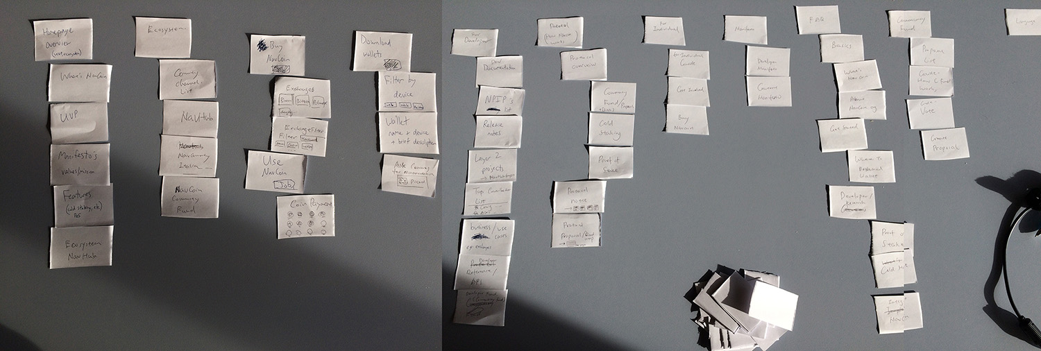
Brainstorming the website objectives, features and contents
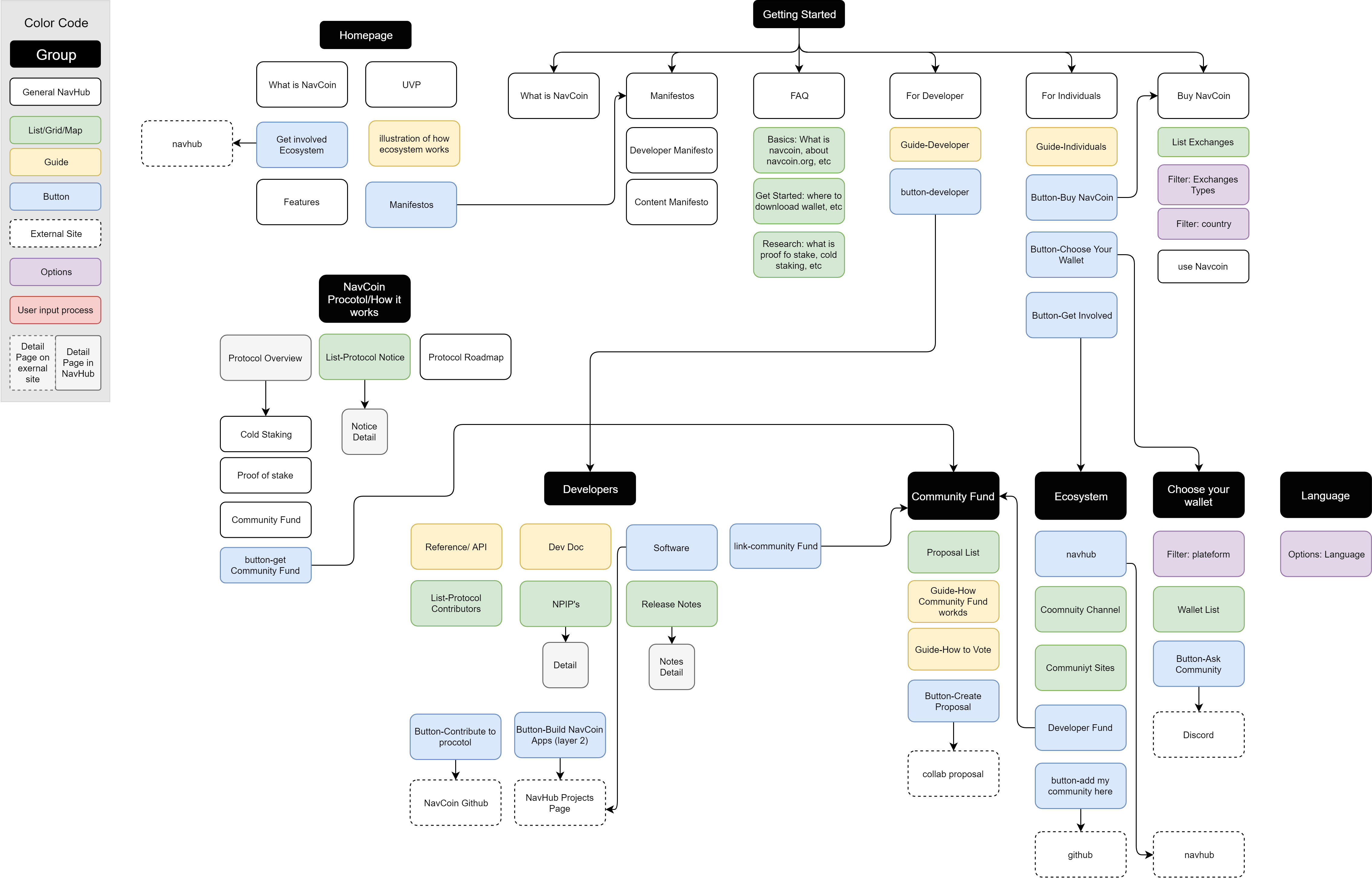
Sitemap developing, showing how we think the content should be grouped for different users
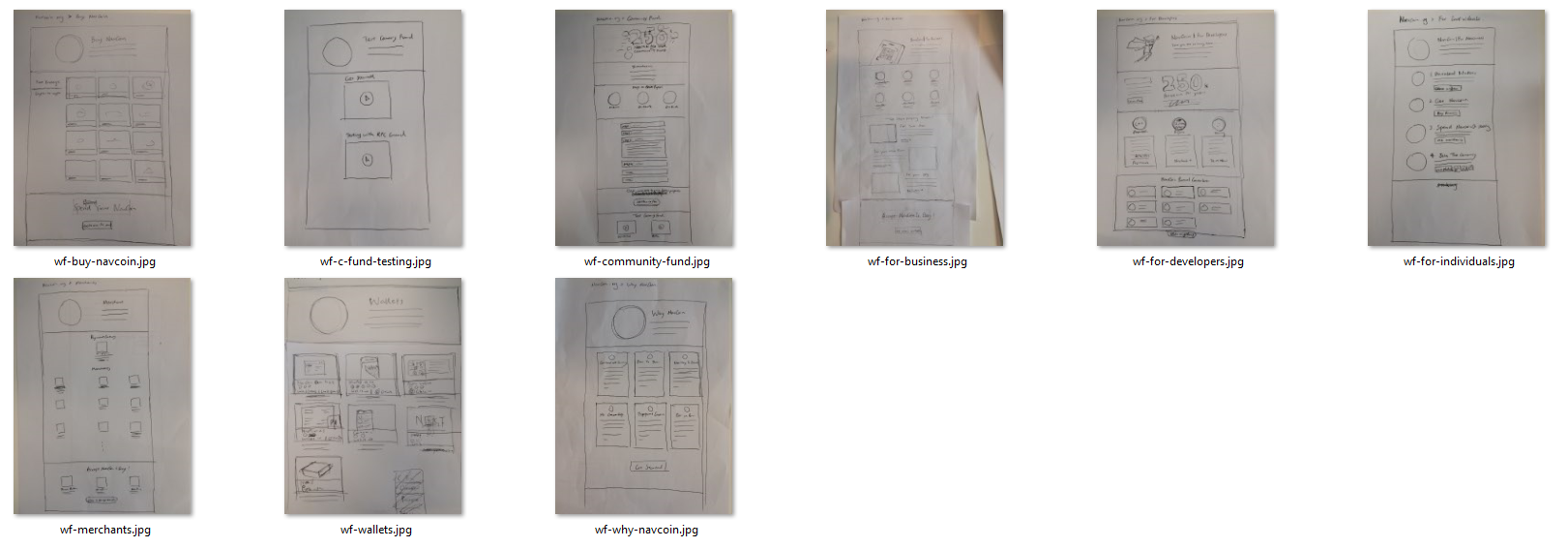
Website Wireframes
Design
Good design isn’t just about looking good. There are thousands of ways to design good UI but we needed to choose the most efficient solution while, of course, looking good. We decided to improve the color, icons, layouts, gradient, UI, fonts, and spacings based on the existing UI templates on the NavCoin.org, but with more attractive visuals and some custom illustrations. It’s practical, beautiful and effective, and everyone on the team is happy with it. Because UI components are the template sections we reuse throughout the site, they needed to be functional and come with various options and different screen sizes. I found a lot of joy in doing it as I was able to completely switch into designer mode.
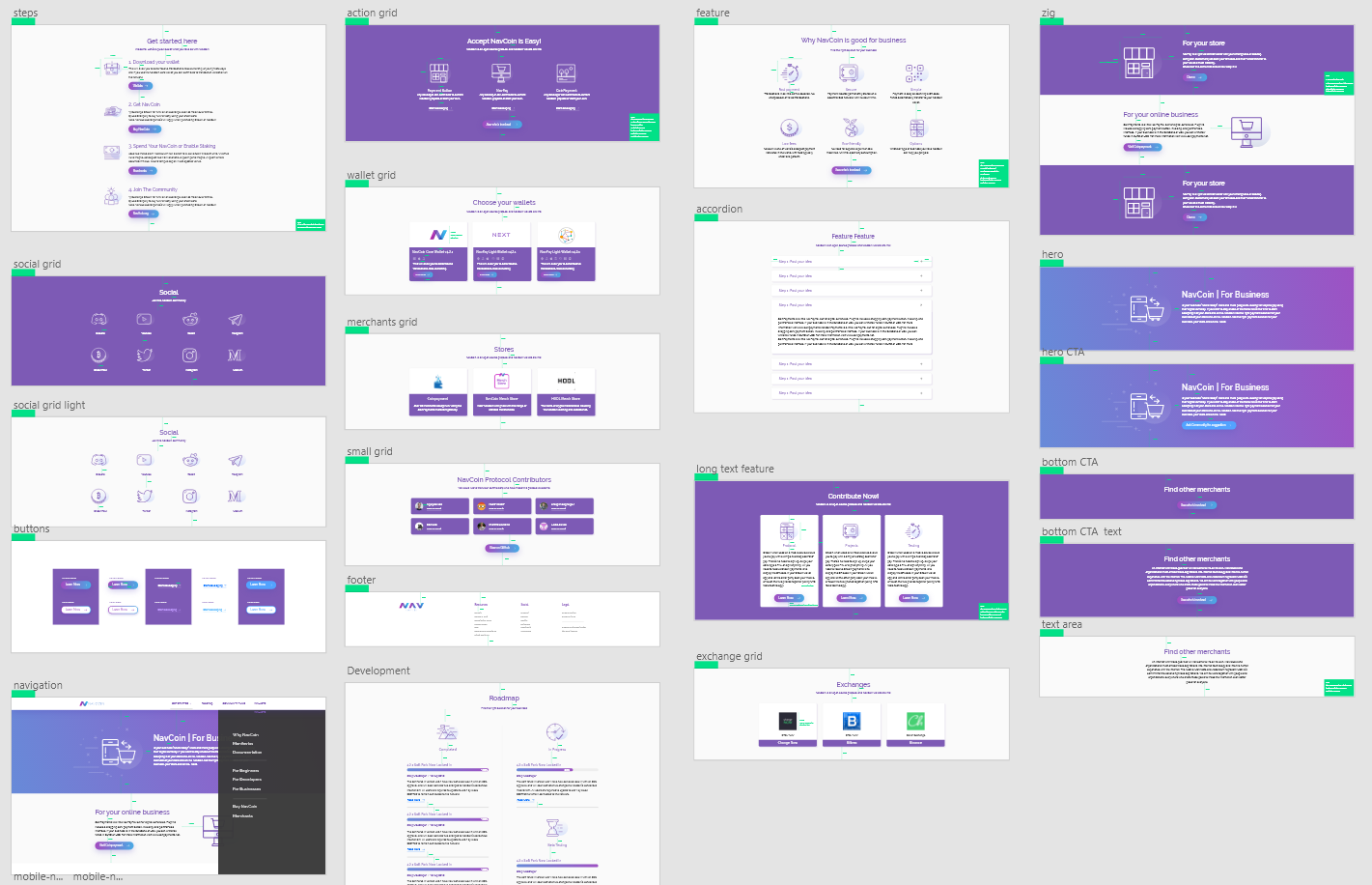
UI template development for desktop
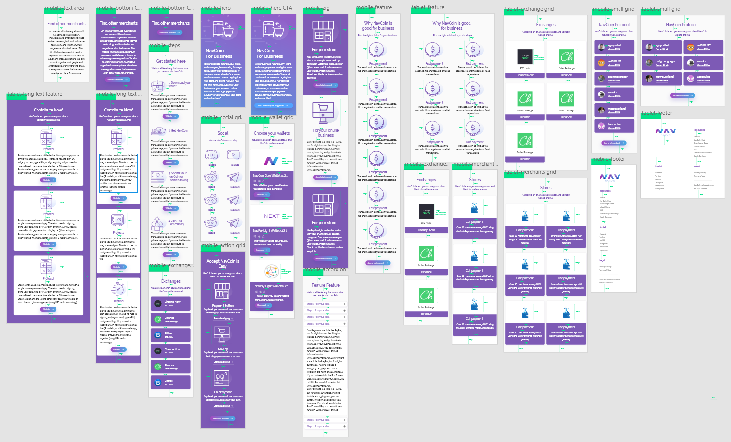
UI template for mobile and tablet screens
Final Steps
Later I coded the UI in bootstrap for an accurate, responsive representation and made notes for the developers. A good design process is all about teamwork and making the hand-off seamless and painless. While the developers worked on creating the templates, I put the design sections together like Lego pieces to make up the different pages. This process allowed us to finesse each page, improve the copy, create more icons, revise the sections and finalize the design. After hours and hours of hard work done by the team, on-going discussions and finally implementing the pages, we present to you the new navcoin.org! (We promote open source, you can download all design resources for free, and you can also find the source code of navcoin.org website to see how the design is implemented).
What’s Next
Our next key project is a redesign of the NavHub website. We want to inspire and build the right tools for people to get involved. We want to make it a community-centric approach for both developers and non-technical users. This means it needs to easy for developers to build projects on top of the NavCoin protocol, have more helpful guides to get started, and have more things that people can contribute based on different their skills and interest, so stay tuned for future updates!